By Lambert Strether of Corrente.
I suppose if I were a clickbait maven, I would have written a headine like “15 Brutal Advertising Tactics Even Naked Capitalism Can’t Bring Itself to Use,” or “You Won’t Believe How Bad Online Advertising Can Be (Because at Naked Capitalism You See So Little of It”). But I’m not, so I won’t. Instead, as I did the last I time I presented such a parade of horribles, a cavalcade of ugly as will shortly follow, I’ll content myself with pointing to our business model, as documented on our policies page:
Yes, we have it. No ads, no site. We don’t like the visual clutter any more than you do but treating this website like an enterprise rather than a hobby requires funding.
Two things you can do to help the enterprise: 1) Whitelist us. Fewer adblockers, and advertisers like us better. 2) Click through ads once in a while, and stay long enough to read them. (Lambert here: I do, for things like camera lenses, where I want to support those businesses and that line of business.) We are not paid on clicks but advertisers like sites more when there are more viewer clickthroughs.
In longer form, we have two funding streams: One is reader donations, as in this fundraiser — the Tip Jar, as always, is to your right — and the other is online advertising. We don’t maximize advertising revenue, and we avoid the kind of advertising that gets between you, reader, and the straightforward process of going to our site, clicking on a link to an article, and reading from the start of the article to the end, without having your reading experience interrupted by any of the horrid object lessons I am about to present. We value your time. We value your sensibilities. And since the most obnoxious ads are the most lucrative, we’re leaving even more money on the table than you might think we are!
That said…. Naked Capitalism is an enterprise, and as an enterprise, we require funding. If this fundraiser — heaven forfend — falls short, we’ll have to look at more ways to sell ads, ugly though that will be (though we’ll never go to autoplay video popups, I promise). Conversely, if advertising — which is under continued, massive assault by Google and Facebook — falls short, we may need to appeal to you again. That said, to the parade of horribles!
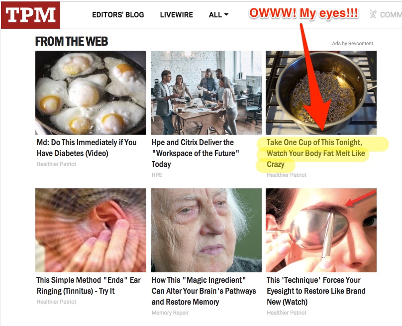
1. We do not publish advertising “blades” that you will never be able to unsee, unlike Talking Points Memo. (Please help us avoid seeing what cannot be unseen by going to the Tip Jar.)
2. We do not force you to click through an advertising “splash” screen to get to your content, unlike Governing (although you may click the Tip Jar to your right):

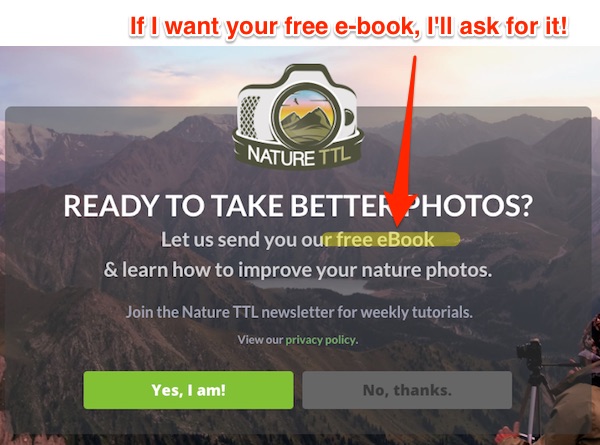
3. We do not force you to click through offers of “free e-books,” although gawd knows we have the content for a hundred e-books, unlike this photography site (The Tip Jar is in the side bar, under the heading “Tip Jar.”)
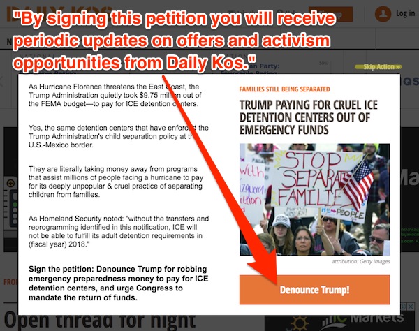
4. We do not force you to click through transparent efforts to scarf up your email address and monetize it, unlike Daily Kos. (You may click the Tip Jar’s Donate or Subcribe links.)
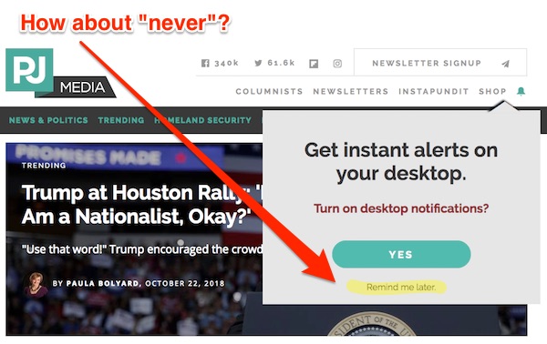
5. We do not have any popups, especially popups that try to suck you into being “notified,” interrupting your flow, or nap, or state of pleasing equanimity with silly — and monetized — messages, unlike PJ Media. (You can even click the Tip Jar’s image of snow leopards).
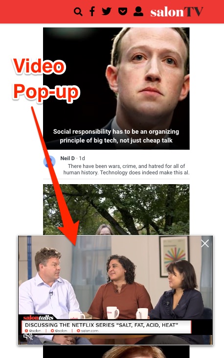
6. We do not have site-busting pop-up videos, because we never fell for Facebook’s “pivot to video” scam in the first place, unlike Salon. (The Tip Jar has not moved. It’s still to your right.)
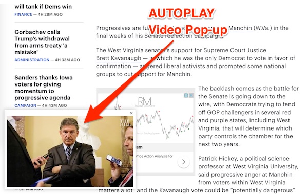
7. We especially do not have autoplay popup videos that keep coming back even if you manage to close them, unlike The Hill. (Perhaps we should make the Tip Jar into a pop-up and put advertising on it?)
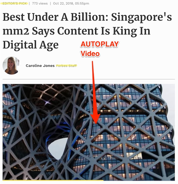
8. We are not Forbes, who also fell for the “pivot to video,” and who combine video autoplay….
9. … with a screen-covering pop-over that forces you to click through it…
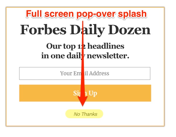
10. … only to come to a second video autoplay! All in the same “Editor’s Choice” article! (Better idea: Make the Tip Jar an autoplay video! With advertising!)
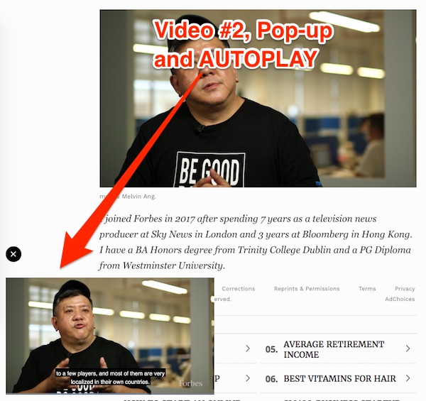
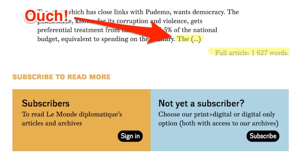
11. We do not pester you to subscribe, because we do not have a subscription model, unlike Le Monde, although to be fair, Le Monde is relatively restrained. (You know why I have to keep doing the hard sell; the Tip Jar is over there ☞☞☞☞☞☞)
12. We do not take up your precious screen real estate with subscription offers demands, unlike The Economist. (The Tip Jar, as it was in items one thorugh ten, is to your right.)

13. We do not use dark patterns, unlike WaPo. (Please reward us for our self-restraint by going to the Tip Jar now!)

(Dark Patterns: “Dark Patterns are tricks used in websites and apps that make you buy or sign up for things that you didn’t mean to.” Look at the Economist’s real-estate-sucking but fair subscription in #12: The buttons are, from left-to-right, “Preferred Offer,” “Second Offer,” close box; the close box at top right is Windows standard, and best practice on the web. So what does WaPo do? They put the close box at the right, but bury it with yet more subscription offers — offers you have already rejected — that they hope you accidentally click on! Ugh.
14. We do not take up your precious screen real estate with subscription offers demands that are so darn complicated they might as well be on the ObamaCare website:
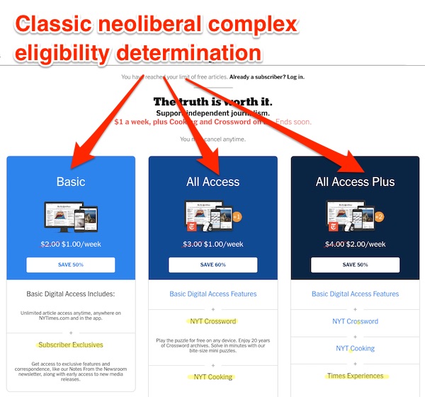
(As a sidebar, it sure is weird that the Times’ basic subscription is news, and if you pay more, you pay for life-style material like the crossword and recipes, or, at the high end, “Times experiences” [shudder]. I can’t help but think that says nothing good The Grey Lady’s management priorities.)
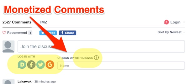
15. Finally, we do not monetize comments, unlike TMZ (or anybody else who uses Disqus or social media logins, because what else would they do with your data? (Unless you have a heart of stone, the Tip Jar is to your right.)
Naked Capitalism can’t do without advertising. But we can — and have — avoided the the most horrid and intrusive practices, as you can see. Your contributions help keep the experience of reading Naked Capitalism simple, clean, and fast, not just for you, but for everyone. Splash screens, popups, autoplay videos, subscription offers, or bizarre advertising “blades” you cannot unsee: All these come between you and your content, which is why we don’t use them. Please make a contribution now if you haven’t already!
